
Colours may be all around us and we often spend many hours choosing them when decorating our home, but do we pay enough attention to what they say about us and our visitors, and the contribution they make to how our home feels?
Do dark colours make a small room feel smaller? Is blue soothing and relaxing? Does yellow make you feel lively and creative? We’ll answer these questions and others in this article.
The science bit…
The psychology of colour is actually quite a young area of academic study in the grand scheme of things. So, what do we know?
“Colours aren’t merely associated with various feelings, they can actually shape our perceptions and personalities.”
This has been evident in numerous studies since the 1700s which have indicated what each colour represents in terms of our personality, work ethic and motivation levels.
What should we think about when choosing colours in our home décor?
Choose a colour scheme that is fit for the room’s purpose – is it a functional space, somewhere to relax or a workspace or playroom in which you might want more mental stimulation. Here are some general pointers:
Warm colours
With a décor dominated by shades of red, pink, yellow, or orange, you will create a cosy, welcoming space. One expert describes warm colours being an indicator that you are an inviting host and your room evokes a friendly, cosy feel. As a result, it is good to use warm colours in your home’s gathering and communal spaces like a living room, such as shades of yellow, orange, and red, particularly to ‘ground’ a large room.
Cool colours
If you want to promote peacefulness, calm and relaxation, then you can’t go far wrong with a room which used blues, purples, and greens. One recent study named navy blue as the world’s most relaxing colour. So, for someone who chooses blues, greens, and purples in their home décor, it is a clear signal that they value harmony and perhaps time for meditation and reflection. And you should certainly think about cool colours in your bedroom or other spaces where you go to unwind after a long day. That’s not to say these colours can’t have a very different effect – jewel tones such as emerald green or sapphire blue can indicate a more moody aesthetic and completely different vibe.
Neutral colours
Whilst it is easy to consider neutral paint colours as just a ‘playing it safe’ option, they can reflect homeowners who think more practically and make long term decisions that they can be happy with. Don’t read this as boring though! People who go for neutrals can be open and cheery, but perhaps quiet and reserved around new people. They may also prefer to use bolder colours for smaller décor features to bring accents to spaces.
White
Sometimes called a ‘non-colour’ along with black, white is associated with extra tidy people who take comfort from their homes being neat and organised. That’s why white is a popular choice for bathrooms, kitchens, utility rooms and other more utilitarian space, with the addition of colour through accessories and furnishings.
And in more detail…
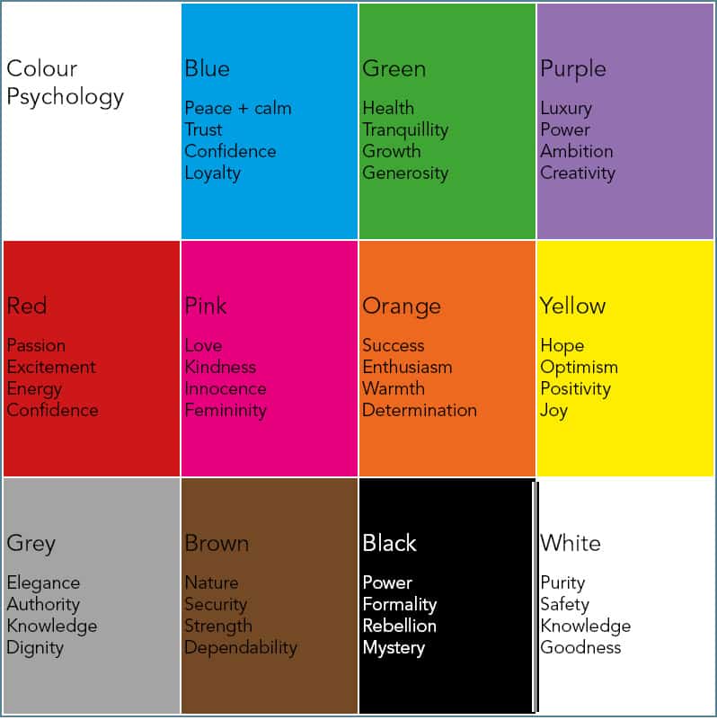
To delve a bit deeper, here are what positive characteristics we associate with the main colours – do you recognise any of these in your personality?
Getting your décor right
It is important to consider the colours of all aspects of your décor to make sure you achieve the right result – and that includes window dressings and shading solutions.
The great thing with Uni-Blinds® integrated blinds, which sit between the panes of glass in double glazed units, is that they are available in a variety of colours so you can tailor your look precisely.
If you choose a Uni-Blinds Venetian integral blind, you can choose from ten colours for the blind slats. That includes contemporary colours like anthracite grey – exclusively available from Morley Glass – and metallic silver, plus softer shades of green, light blue, yellow and cream. The headrail and other features of the Venetian blind’s control system are available in several complementary colours too.
For Uni-Blinds pleated between the glass blinds, the choice is even wider so you can express your personality to the max. Their fabrics are available in everything from a bold red and navy blue to cool greys. And, despite the name, even the Uni-Blinds pleated blackout integral blind doesn’t have to be black – it comes in a choice of eight colours from white and beige to anthracite grey and black.
Find out more about the colour options for Uni-Blinds on our dedicated colours page.